︎ Case Study: Benalla Art Gallery Identity Development
Timeline –
3 weeks
3 weeks
Role –
Identity Development
Identity Development
For –
Benalla Art Gallery, Victoria
Benalla Art Gallery, Victoria
With –
RMIT Master of Communication Design supervisor Stuart Geddes
RMIT Master of Communication Design supervisor Stuart Geddes

Overview
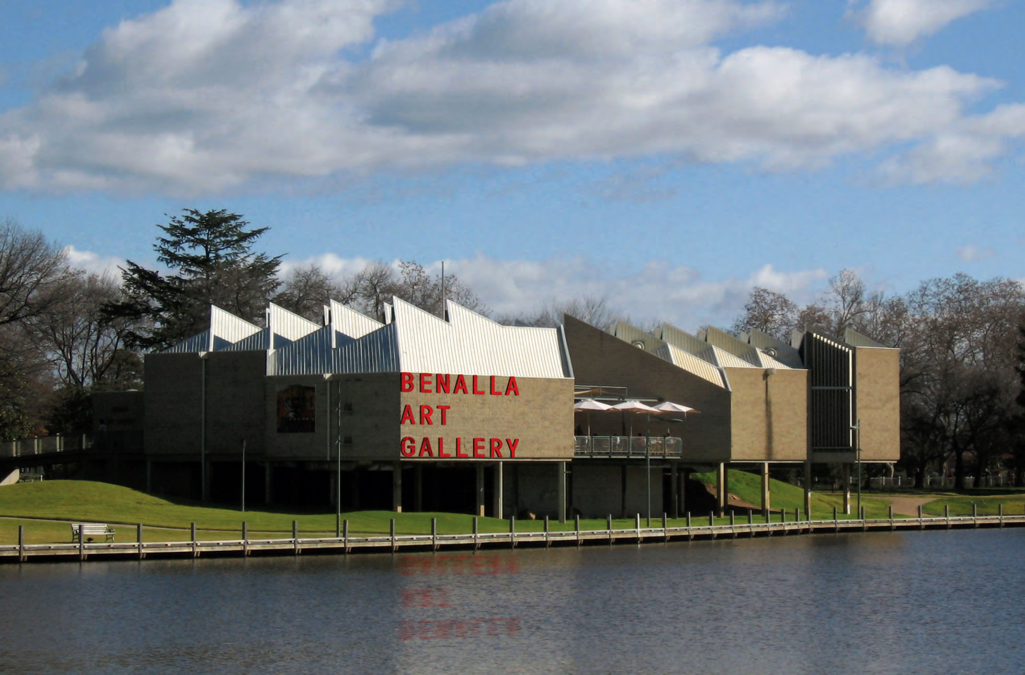
Benalla Art Gallery
Benalla is a small regional city about two hours north of Melbourne, Victoria. The gallery is housed in a great purpose-built brutalist building built in 1975 that sits on the edge of Lake Benalla and is one of the leading regional galleries in Australia. The existing identity for the system was a mixture of inherited signs and occasional Council-supplied ephemera and typography. The gallery director was managing the design work with an eye to minimal typography and foregrounding images.
My Role
Benalla Art Gallery
Benalla is a small regional city about two hours north of Melbourne, Victoria. The gallery is housed in a great purpose-built brutalist building built in 1975 that sits on the edge of Lake Benalla and is one of the leading regional galleries in Australia. The existing identity for the system was a mixture of inherited signs and occasional Council-supplied ephemera and typography. The gallery director was managing the design work with an eye to minimal typography and foregrounding images.My Role
Identity Design
This project was created as part of my Master of Communication Design at RMIT University. The goal was to develop a typographically-led identity system for the Benalla Art Gallery.Background

Background & Context
As part of the preliminary phase, I conducted an extensive analysis of gallery backgrounds and locations. Opened in 1975, the striking brutalist building is situated on the edge of Lake Benalla among historically significant botanical gardens. The soaring geometric structure, clad with ribbed concrete block, is raised above the flood line of the lake. Victorian Minister for Planning, Richard Wynne, named it among his favourite pieces of architecture describing it as “the most beautifully sited regional art gallery.”
Aspirations
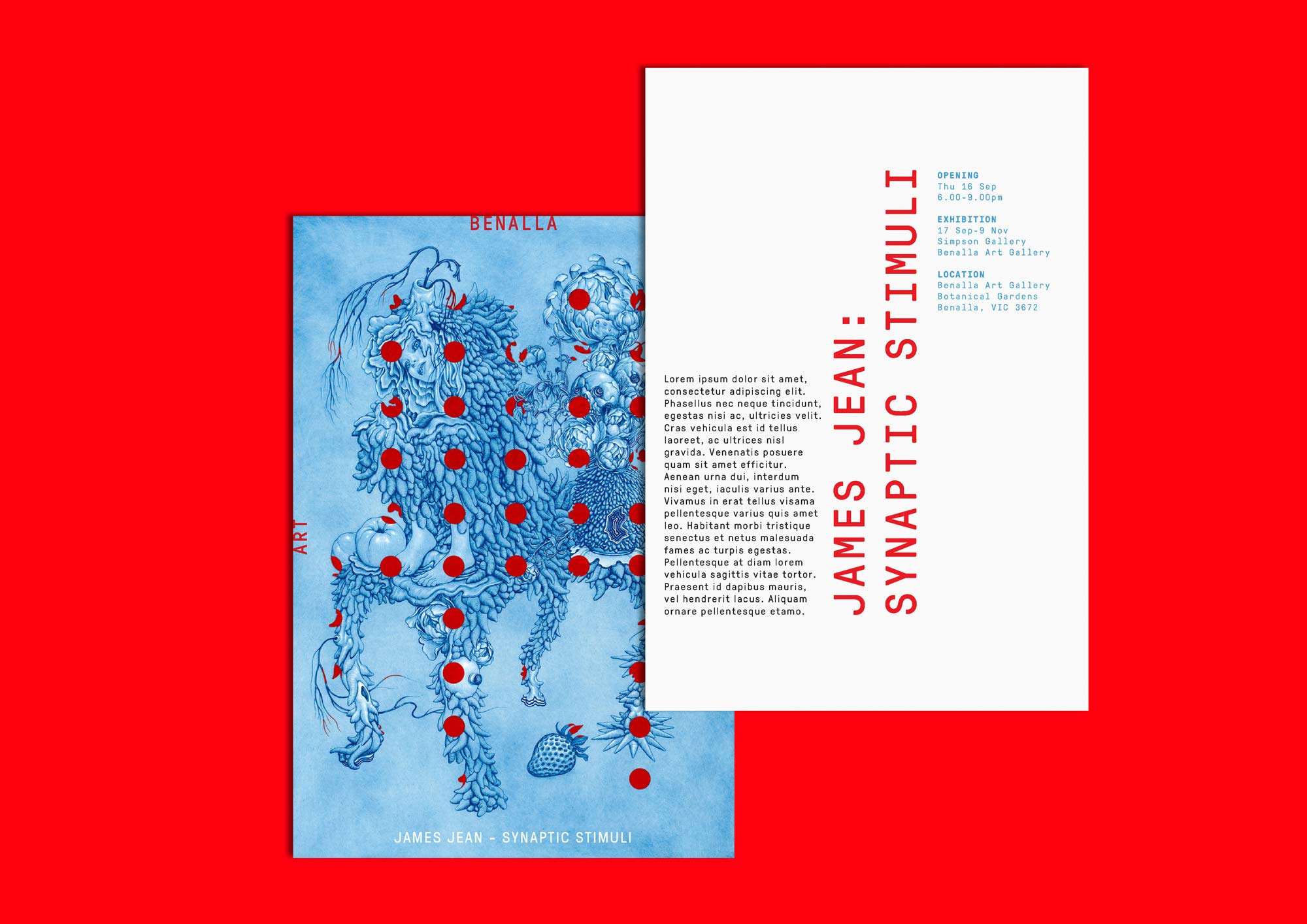
The new identity needed to be bold and contemporary, but also reflect a sense of the elegance and picturesque nature of the Gallery’s location.
Applications
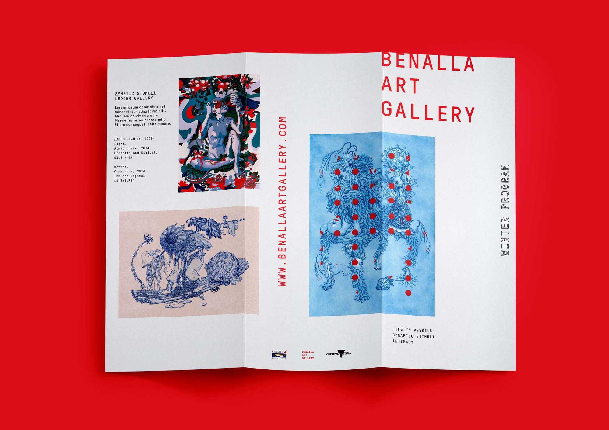
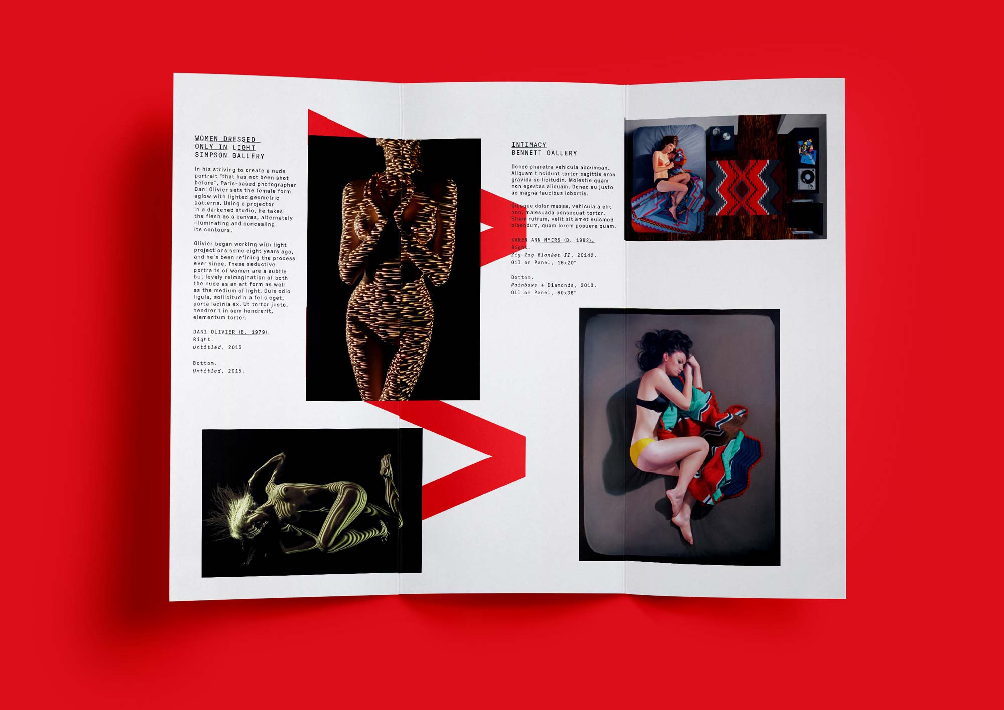
Internal and external permanent and temporary signage/wayfinding system, stationery (letterhead business cards), invitation, promotional flyer, website.
As part of the preliminary phase, I conducted an extensive analysis of gallery backgrounds and locations. Opened in 1975, the striking brutalist building is situated on the edge of Lake Benalla among historically significant botanical gardens. The soaring geometric structure, clad with ribbed concrete block, is raised above the flood line of the lake. Victorian Minister for Planning, Richard Wynne, named it among his favourite pieces of architecture describing it as “the most beautifully sited regional art gallery.”
Aspirations
The new identity needed to be bold and contemporary, but also reflect a sense of the elegance and picturesque nature of the Gallery’s location.
Applications
Internal and external permanent and temporary signage/wayfinding system, stationery (letterhead business cards), invitation, promotional flyer, website.
Visual Development
Inspiration
The Benalla Art Gallery identity system draws inspiration from the philosophy behind Brutalist architecture, which was popular with architects such as Le Corbusier because of it's ‘honest,’ uncompromising, and progressive nature.
The Benalla Art Gallery identity system draws inspiration from the philosophy behind Brutalist architecture, which was popular with architects such as Le Corbusier because of it's ‘honest,’ uncompromising, and progressive nature.

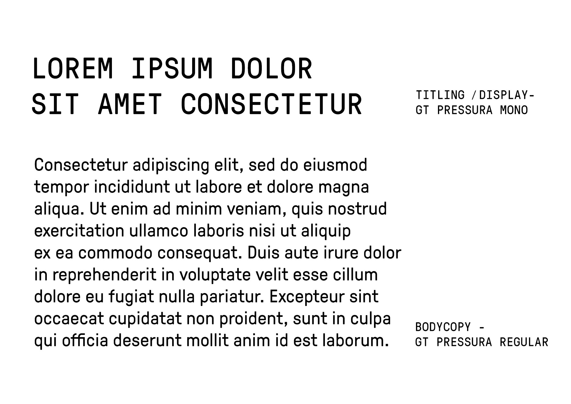
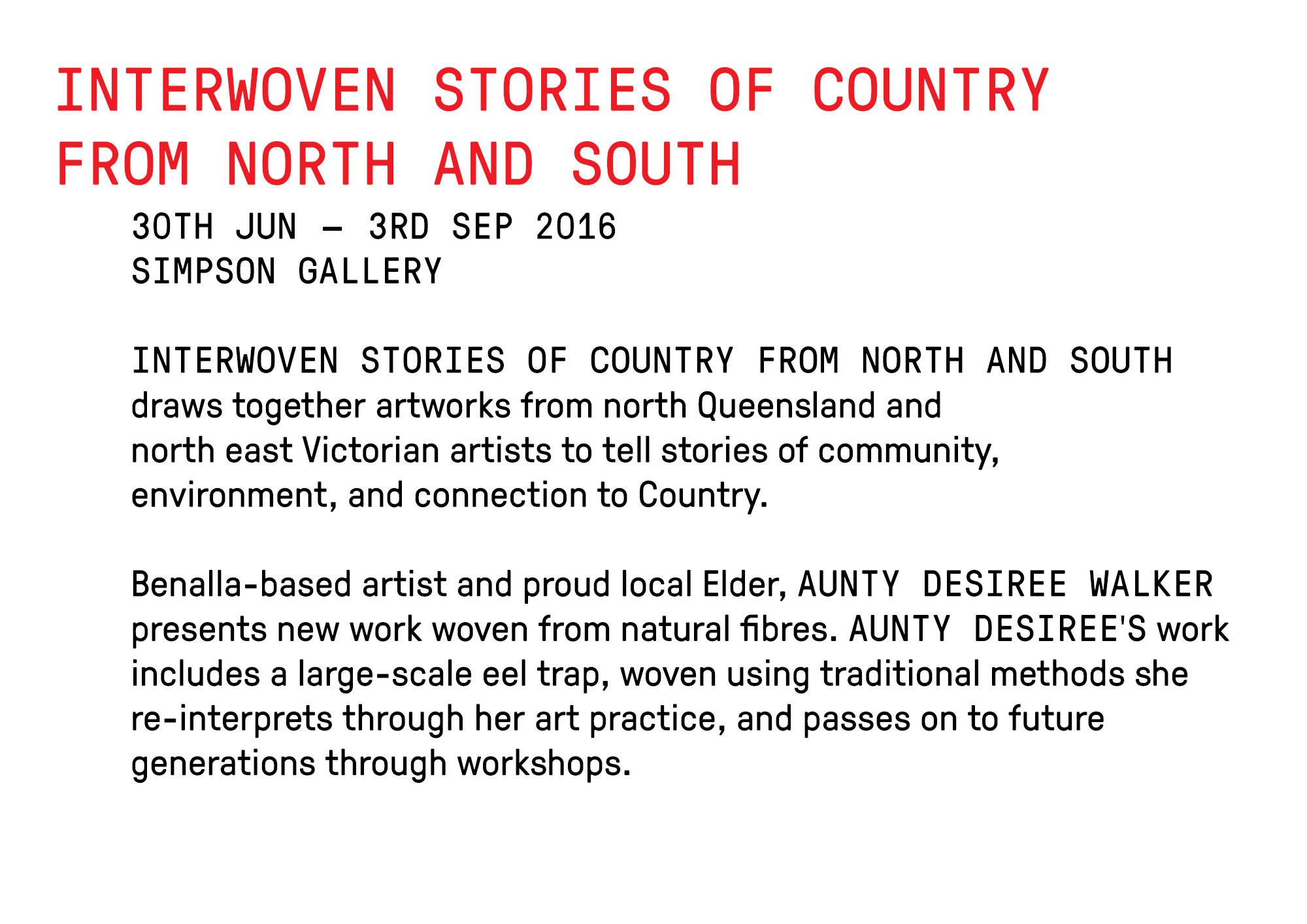
Color & Typography
The primary typeface chosen to represent refreshed identity was GT Pressura; it’s subtly rounded edges exude a friendly personality while evoking the utilitarian style of Brutalism. The color palette chosen was also kept minimal, incorporating Black, White, and Red. Red was specifically chosen for its raw and powerful characteristics – ensuring instant recognition and impact, and strong contrast with an otherwise very minimal color palette.
The primary typeface chosen to represent refreshed identity was GT Pressura; it’s subtly rounded edges exude a friendly personality while evoking the utilitarian style of Brutalism. The color palette chosen was also kept minimal, incorporating Black, White, and Red. Red was specifically chosen for its raw and powerful characteristics – ensuring instant recognition and impact, and strong contrast with an otherwise very minimal color palette.
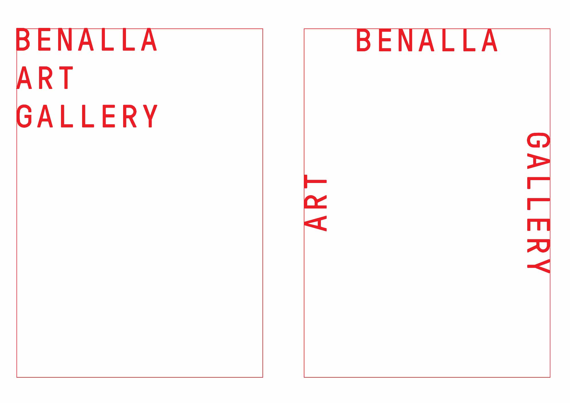
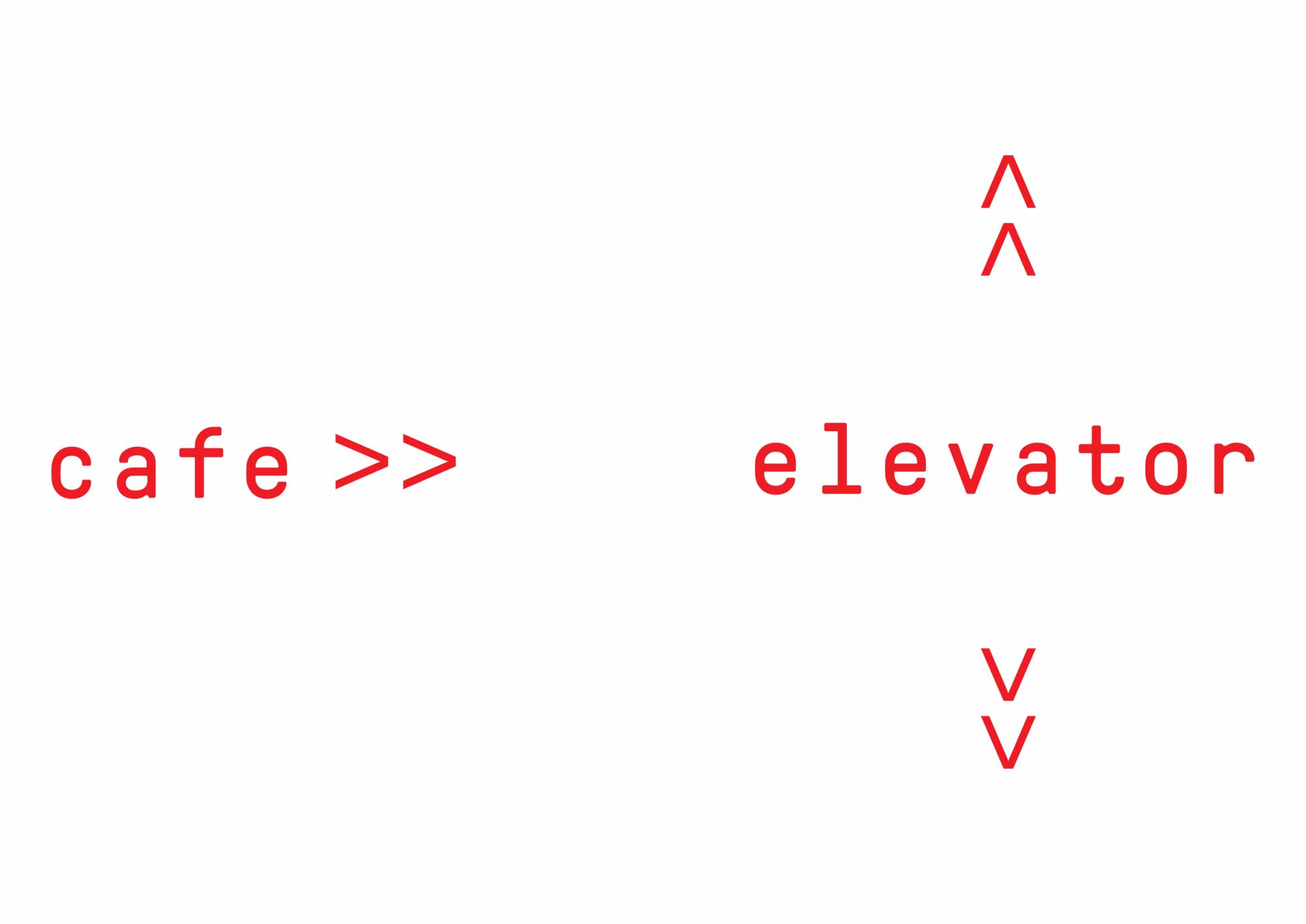
Grid System & Extension
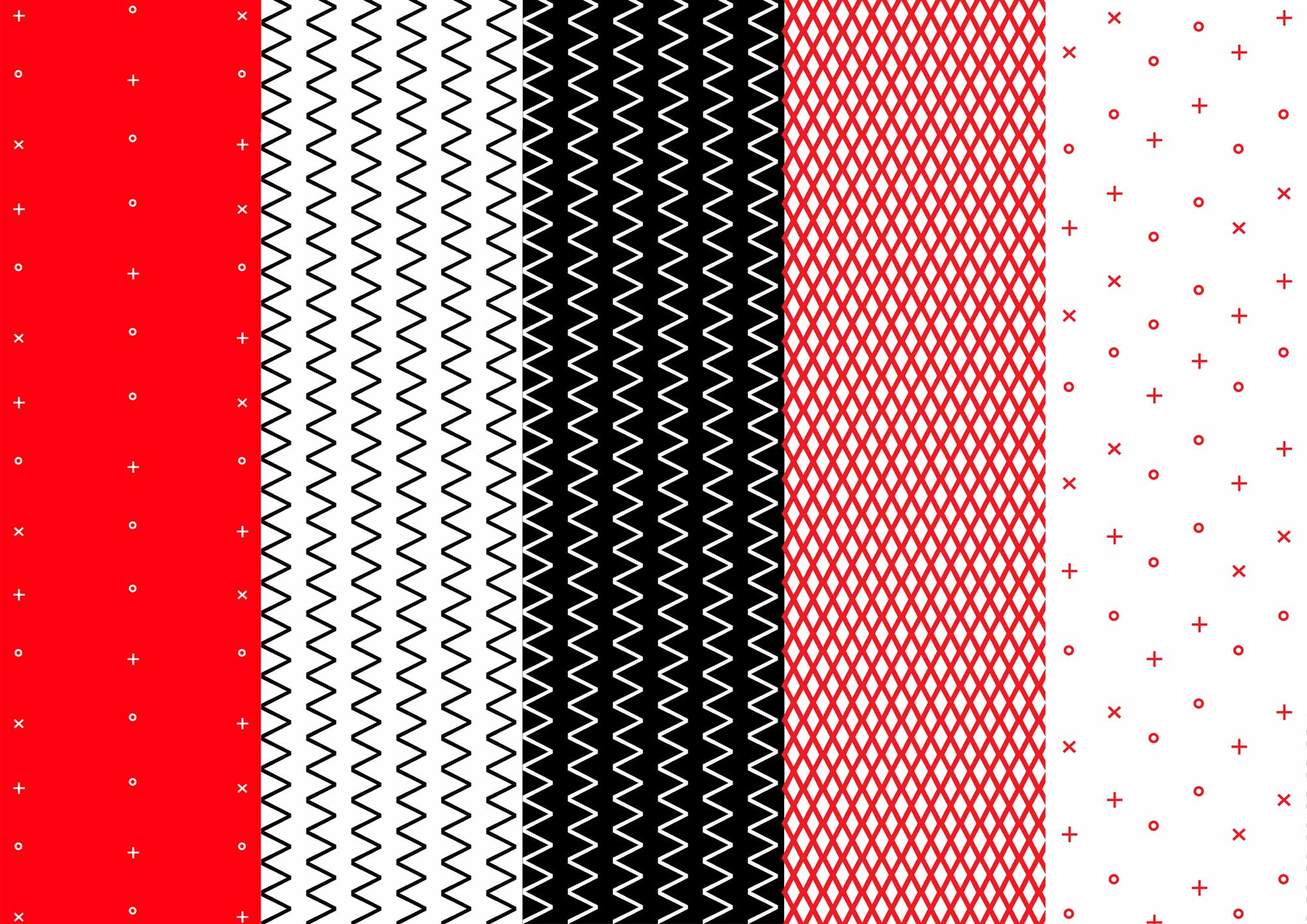
The typographic nature of the identity allows for a versatile system that can be extended upon through patterns composed of typographic elements. Coupled with a flexible grid, the overall identity system allows for playful and adaptive applications.
The typographic nature of the identity allows for a versatile system that can be extended upon through patterns composed of typographic elements. Coupled with a flexible grid, the overall identity system allows for playful and adaptive applications.


Outcomes
The new Benalla Art Gallery branding exudes a stripped-back brutalist identity, building on typography and color as the foundation extending across all touchpoints. This cohesive and flexible approach places the gallery’s events & artwork at the forefront, with the design elements providing a supportive framework that enhances and elevates the exhibited pieces.


Credits
Project supervisor: Stuart Geddes