︎ Case Study: A/D/O Water Futures Data Visualization
Timeline –
1.5 months
1.5 months
Role –
Data Analysis
Data Visualization
Data Analysis
Data Visualization
For –
A/D/O by MINI, New York
A/D/O by MINI, New York
With –
Art Directors: Ari Joseph, Noelle Roth
Other researchers & contributors.
Art Directors: Ari Joseph, Noelle Roth
Other researchers & contributors.

Overview
Water Futures
The Water Futures program, a collaboration between A/D/O New York and Jane Withers Studio, explored the future of drinking water and its relationship with urban environments. With a focus on water scarcity, pollution, and climate change, the program aimed to raise awareness, inspire innovative solutions, and deepen our understanding of water resources. The program brought together a multidisciplinary team of experts, fostering collaboration among designers, scientists, researchers, policymakers, and industry professionals through workshops, seminars, and research initiatives.
My Role
Data Analysis & Information Design
I was approached by A/D/O to translate research data from the Water Futures program into a visually engaging format for their catalogue. My task was to effectively present the research findings through cohesive and visually engaging representations.
Water Futures
The Water Futures program, a collaboration between A/D/O New York and Jane Withers Studio, explored the future of drinking water and its relationship with urban environments. With a focus on water scarcity, pollution, and climate change, the program aimed to raise awareness, inspire innovative solutions, and deepen our understanding of water resources. The program brought together a multidisciplinary team of experts, fostering collaboration among designers, scientists, researchers, policymakers, and industry professionals through workshops, seminars, and research initiatives.My Role
Data Analysis & Information Design
I was approached by A/D/O to translate research data from the Water Futures program into a visually engaging format for their catalogue. My task was to effectively present the research findings through cohesive and visually engaging representations.The Data
Data Sources
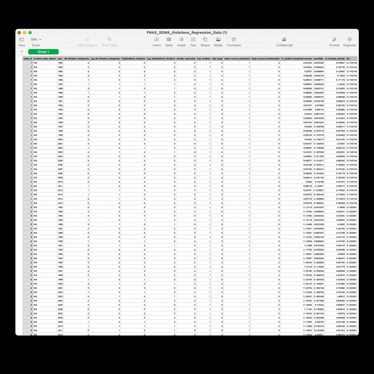
I was provided with data from diverse and reputable sources, including:
I was provided with data from diverse and reputable sources, including:
-
Water Futures Researchers (Maura Allaire, Haowei Wu, and Upmanu Lall)
-
Congregational Budget Office (CBO)
-
National Performance of Dams Program by Stanford University (NPDP)
-
Euromonitor Forecast
-
National Inventory of Dams (NID)
-
Proceedings of the National Academy of Sciences (PNAS)

Data Processing
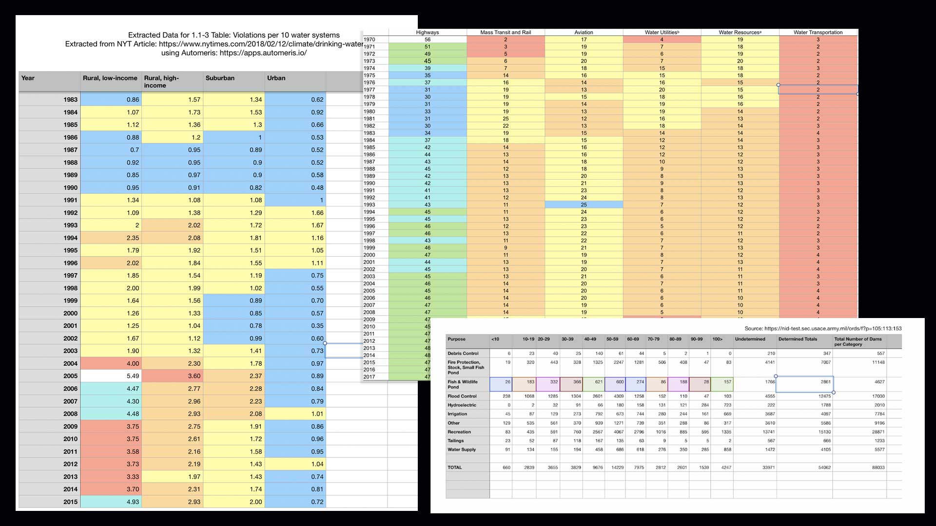
Preliminary Analysis
I conducted a thorough analysis to enhance data comprehension and extract key insights. This involved organizing and refining the data to ensure its meaningful representation. This stage laid the foundation for exploratory analysis and subsequent data visualization strategies, identifying the ‘building blocks’ for visualisations.
I conducted a thorough analysis to enhance data comprehension and extract key insights. This involved organizing and refining the data to ensure its meaningful representation. This stage laid the foundation for exploratory analysis and subsequent data visualization strategies, identifying the ‘building blocks’ for visualisations.
Visualization Development
Visual Language
During the exploratory analysis and throughout the process, I collaborated closely with A/D/O's team to establish a visually impactful design that aligned with the project's identity. We chose a black and white color palette, inspired by MINI's branding, to create a visually striking aesthetic. However, conveying complex information using only two colors posed challenges. To address this, I employed distinct forms to differentiate data categories and enhance clarity in communication.
During the exploratory analysis and throughout the process, I collaborated closely with A/D/O's team to establish a visually impactful design that aligned with the project's identity. We chose a black and white color palette, inspired by MINI's branding, to create a visually striking aesthetic. However, conveying complex information using only two colors posed challenges. To address this, I employed distinct forms to differentiate data categories and enhance clarity in communication.


Style Guide
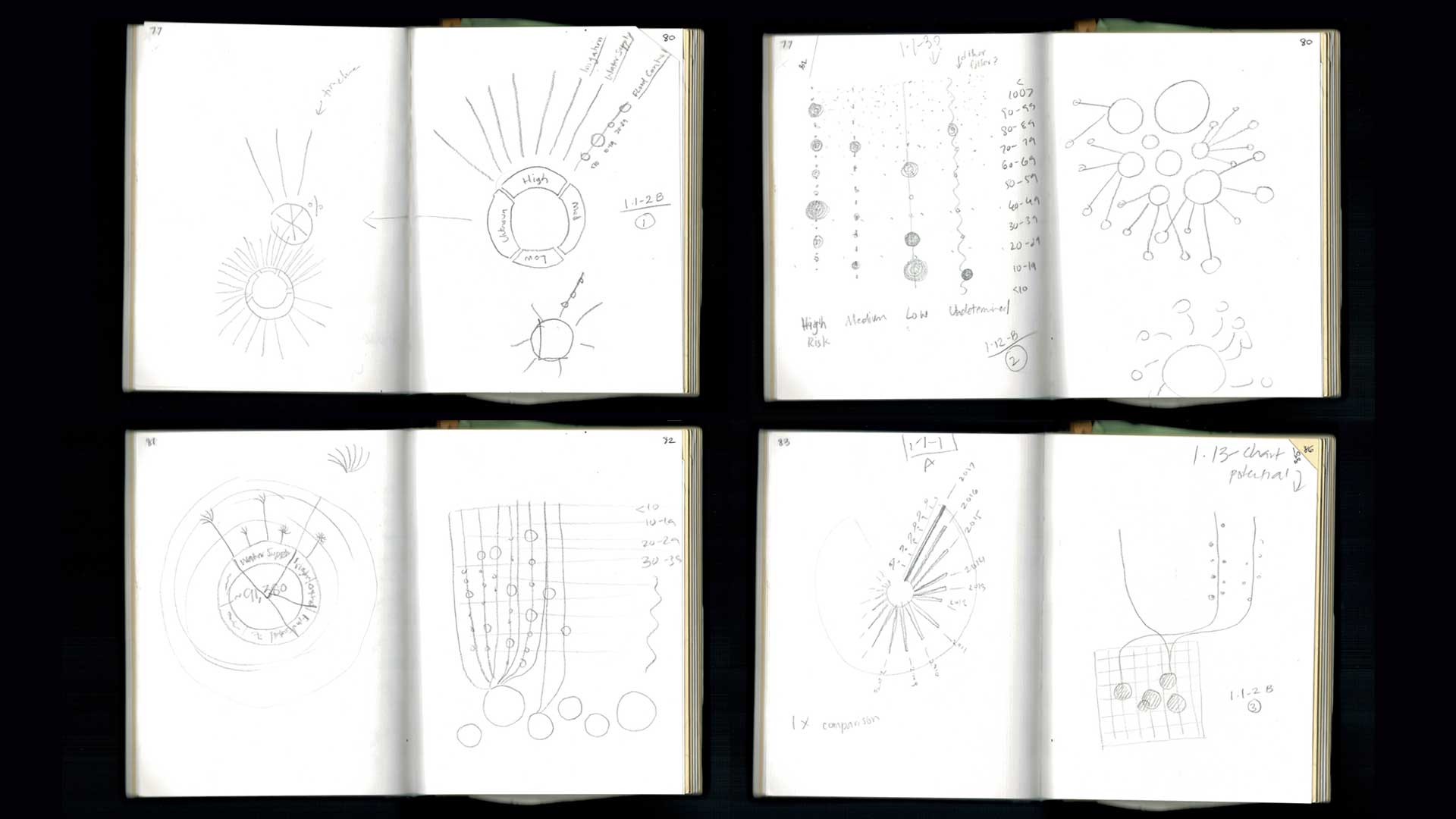
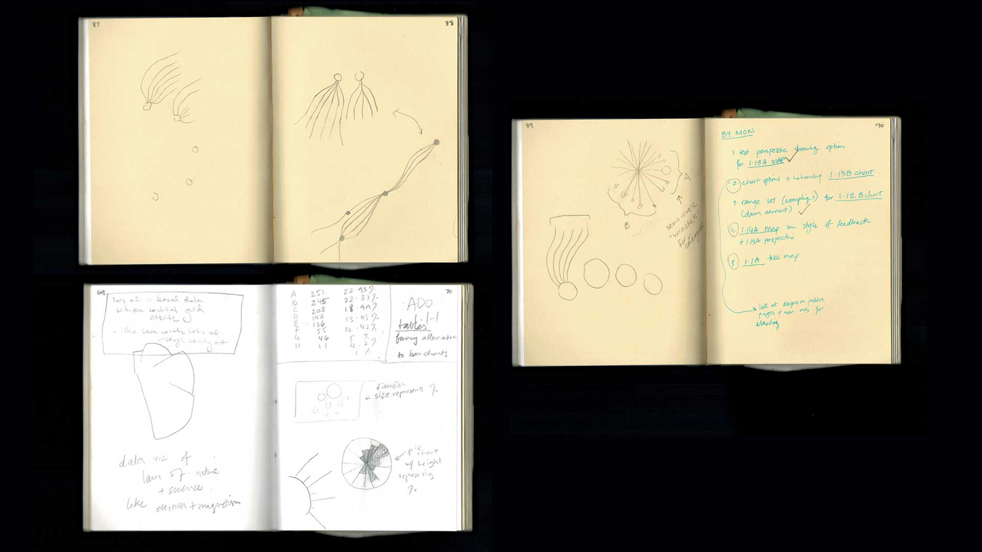
Sketching on paper allowed creative freedom in visualizing numerical data and enabled me to quickly test different visualization models for information representation, as well as assess their complexity and flexibility. These sketches played a crucial role in identifying the emergence of a visual language, which ultimately became the project's overarching style guide.
Sketching on paper allowed creative freedom in visualizing numerical data and enabled me to quickly test different visualization models for information representation, as well as assess their complexity and flexibility. These sketches played a crucial role in identifying the emergence of a visual language, which ultimately became the project's overarching style guide.
Testing & Iteration
After finalizing the initial sketches, I tested the visualization models using the datasets to gauge their effectiveness in conveying the intended information. Through continuous collaboration with the art director and iterative refinements, the designs further evolved and improved. This collaborative process ensured that the final visualizations were precisely refined and aligned with the project's objectives.
After finalizing the initial sketches, I tested the visualization models using the datasets to gauge their effectiveness in conveying the intended information. Through continuous collaboration with the art director and iterative refinements, the designs further evolved and improved. This collaborative process ensured that the final visualizations were precisely refined and aligned with the project's objectives.
Outcomes
The final visualizations were prominently featured in A/D/O's Water Futures catalogue Where Will The Water Come From?
As the sole data visualizer, it was both a privilege and a responsibility to contribute to the project and help communicate the findings effectively.
As the sole data visualizer, it was both a privilege and a responsibility to contribute to the project and help communicate the findings effectively.
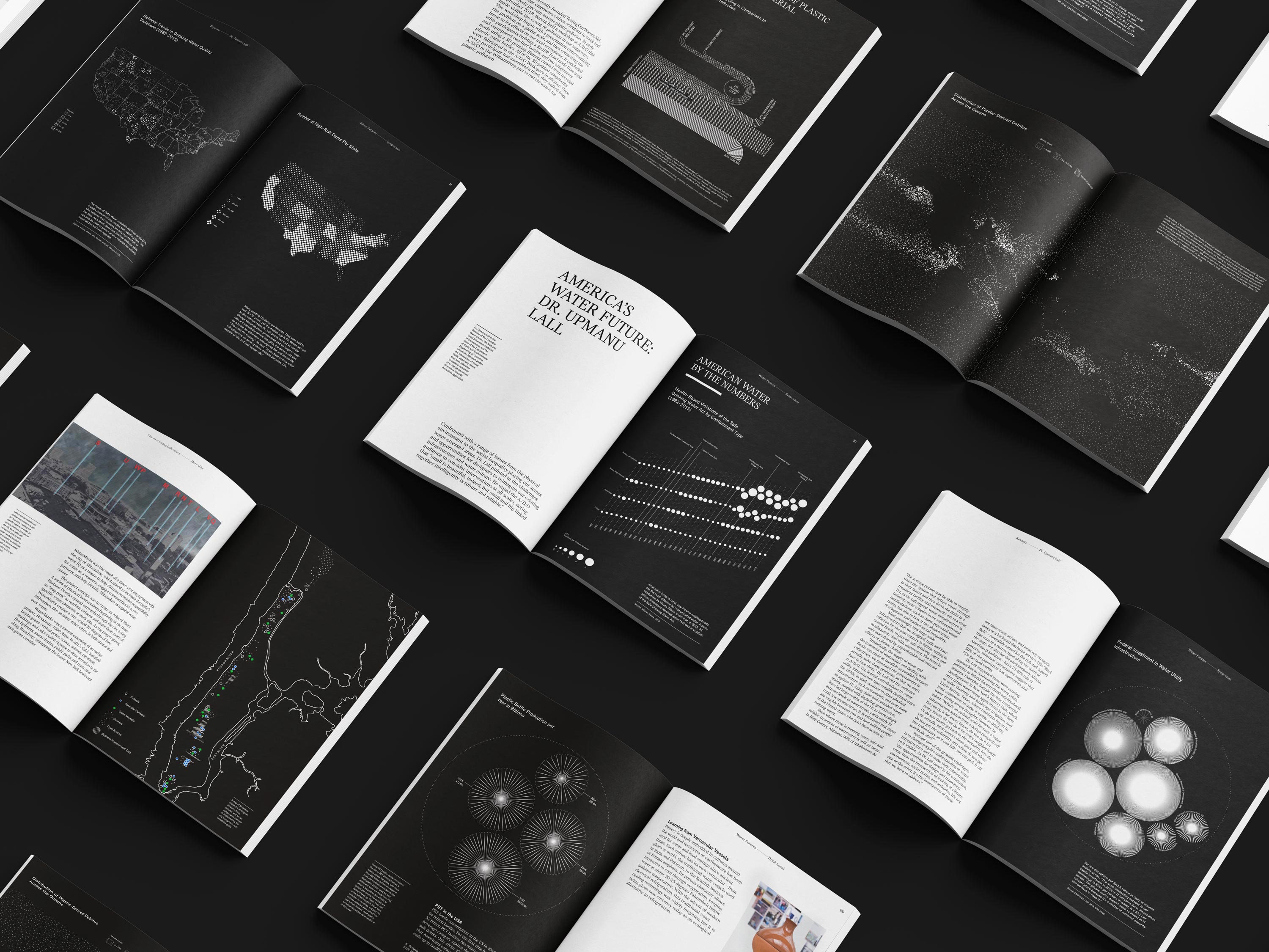
The final visualizations translate the research data in a visually captivating and cohesive manner. Aligning with Water Futures goals, I hope they serve as tools to raise awareness and foster meaningful conversations about the pressing issue at hand. Through promoting engagement and accessibility, I hope the visualizations contribute to the program's mission of inspiring positive action towards a sustainable future.
Reflections
I am immensely grateful for the opportunity to be a part of the Water Futures project, which has been transformative experience for me as a designer and consumer.
Through this project, my perspective regarding the importance of interest and harmony in data visualization design has solidified. Visualisations should reflect the diverse range of data and, whenever possible, serve as visual cues that capture viewers' interest and reinforce the topic at hand.
Exploring visualizations beyond simplistic charts is essential; simplistic charts often struggle to represent complex data accurately, leading to potential misinterpretation. By embracing alternative visualizations, we can convey intricate relationships and patterns with clarity. Visually captivating approaches play a pivotal role in engaging audiences and creating a lasting impression. Complex topics particularly benefit from sophisticated visualizations, enabling deeper understanding and analysis.
Credits
Curated by Jane Withers
Edited by Sheetal Shah
Art Direction & Creative Direction by Ari Joseph
Associate Art Director & Lead Design by Noelle Roth
Data Visualization by Rida Abbasi
Section Illustrations by Ariel Davis
Contributions & Research by Ria Hawthorn, Christina Huber, Corinne Mynatt, Natalie Nielsen, Miranda Vane
Co-Editing by Dan Howarth, Lily Consuelo, Saporta Tagiuri